You Can Build Beautiful Interactive Animations With Codex Too
Most people think of Codex as a static page generator. That is only part of what it can do. Give it a clear breakdown of your business actions, interaction states, and visual feedback, and it will produce interactive animations that genuinely communicate what your product does. No design background required.
The trick is describing the business action, not the visual style. If you start with “make it look premium,” you will get something that looks fine but misses the point every time.
This post walks through a real POD website page built with Codex. The platform lets designers, influencers, and independent sellers create product mockups and push them live across Etsy, Shopify, WooCommerce, TikTok Shop, and more. The entire back end, from order syncing to production and fulfillment, runs automatically.
The goal of the landing page is simple: a visitor scans it for two seconds and already understands what the service does. Without an animation, that is genuinely hard to pull off.
Break Down the E-commerce Action First, Then Ask Codex to Animate It
The first thing to get right is the action breakdown. Before touching visual style at all, ask four questions:
What e-commerce action does the animation represent? Which element does the user interact with? What does the page feedback during the operation? What does the user do next after the action completes?
For the hero section, the breakdown looked like this:
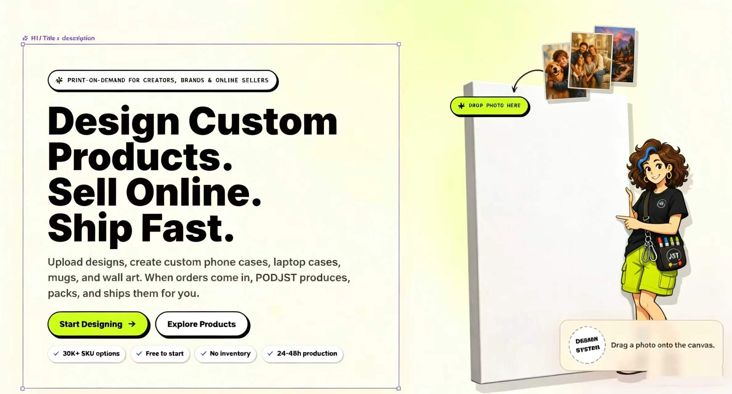
Build a POD homepage hero section. Keep the title, description, and CTA on the left. On the right, add a blank canvas. Place three draggable photos above the canvas. When the user drags a photo onto the canvas area, the canvas highlights. On release, switch the blank canvas to a printed canvas mockup. Update the bottom status text to "Canvas mockup ready for your store." Add a character figure standing next to the canvas to guide the interaction.
What the page looks like before the user drags anything:

What it looks like after the drag-and-drop completes:

The animation looks like an image swap. Underneath it is a state machine.
type InteractionState = “idle” | “dragging” | “hovering” | “printing” | “success”;
idle: “Drag a photo onto the canvas.”
hovering: “Release it to print on canvas.”
success: “Canvas mockup ready for your store.”
Codex got it right the first time because the prompt described what changes at each state, not how the animation should feel. The idle state tells the user what to do. The hovering state confirms intent. The success state closes the loop. Three lines. No ambiguity about what the animation communicates.
Connection, Sync, and Generation Work Well for Transaction Animations
Whether a selling point is worth animating comes down to one test: does it have a before and after state?
Unconnected to connected. Not uploaded to uploaded. Blank product to customized product. Not published to published.
When nothing is clicked yet, the platform cards sit there doing nothing. Click Etsy, and the connection establishes visually. Click Shopify, and the same thing happens. The logos are still there, but now the user sees them working together.
The prompt for this was not “show platform logos.” It was “show the store connection happening.” That single shift in wording changes what Codex builds.
The key is treating this as a product action, not a logo wall. Users see the platforms linking together and immediately understand: I can connect Etsy, Shopify, WooCommerce, TikTok Shop, and the rest, then push finished designs to those stores without touching fulfillment myself.
Product Display Can Go One Step Further to Show Users the Change
Static product shots on white backgrounds are clean. They also leave room for the buyer to wonder what the actual product looks like in use.
The better pattern is mockup by default, usage scene on hover.
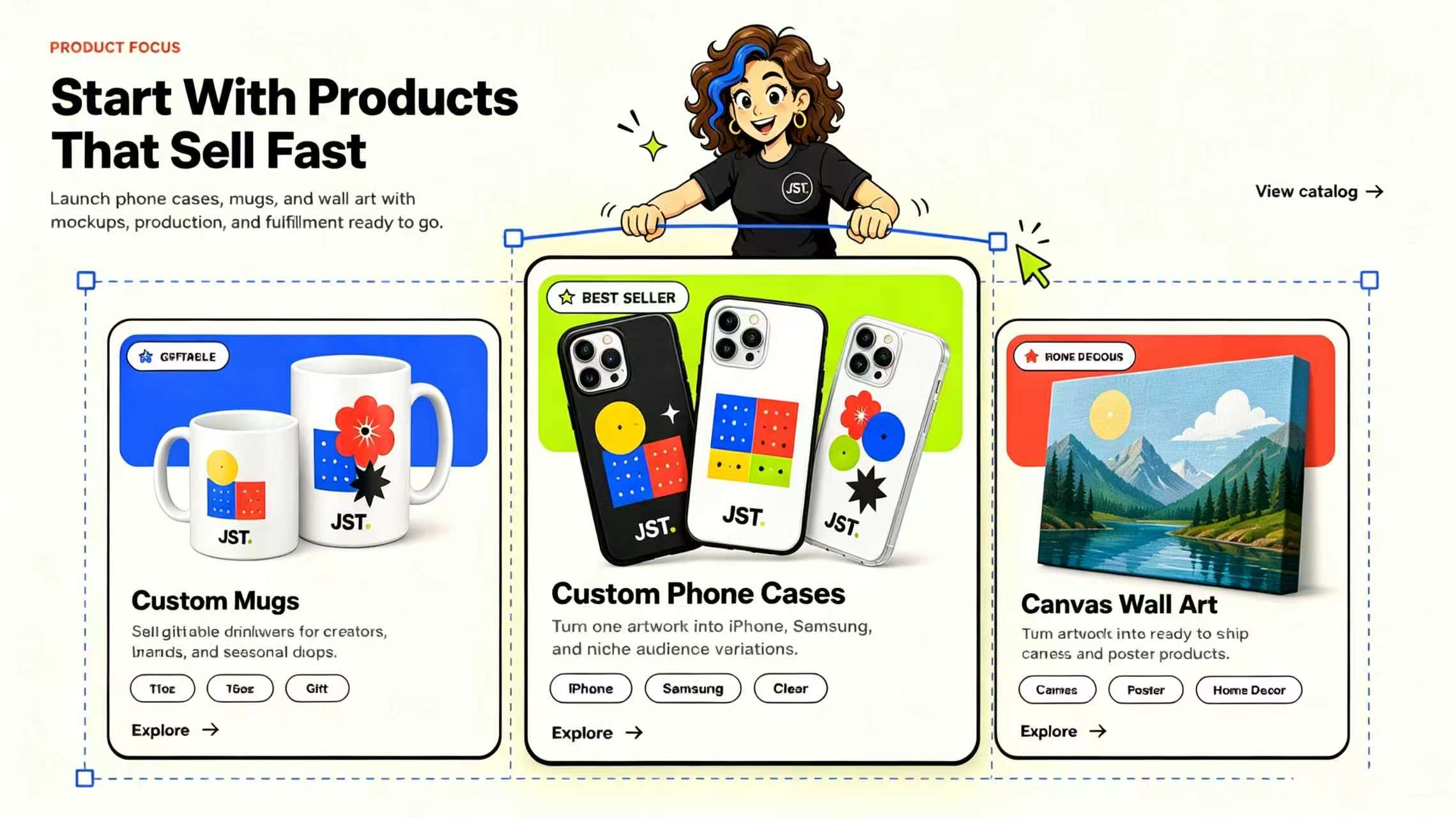
Build a Product Focus module. Display three product cards. Make the center card larger and taller as the best seller. Show mugs on the left and canvas wall art on the right. Have a character figure pull the entire product module from above. Display mockup images by default. On mouse hover, switch to printed or usage scene images.
The most important split here is mockup image versus scene image. Default to the clean mockup. Hover reveals the real-world context. One hover tells you more than three bullet points about what you are buying.
This project came from a POD platform built around print-on-demand fulfillment. Designers and creators handle the creative side. The platform handles everything after the sale: production, packing, shipping, and customer service.
Why Us Sections Can Be Interactive Explanations Instead of Bullet Lists
Most Why Us sections are five claims the visitor skims and forgets. The version that lands is a list on the left with a live explanation on the right.
Click “No Inventory” and the right panel shows how sell-first-produce-after works. Click “Store Connect” and the platform connection appears. Click “Fast Local Fulfillment” and a fulfillment map with routing nodes shows up.
The visitor reads the claim and then watches it work. That is the difference between marketing copy and a product demo. The section stops reading like self-praise and starts reading like evidence.
A Reusable Prompt Template for Any Interactive Module
This structure works across different modules and keeps Codex focused on interaction logic instead of inventing aesthetics.
I am building a [module name].
The business goal is [what the user needs to understand].
The page has [element A / element B / element C].
The user can [click / drag / hover] on [element].
On action start, the page state is [idle].
During the action, the page state is [dragging / hovering / active].
On action complete, the page state is [success].
Visual feedback includes [highlight / enlarge / image swap / button appearance / character reaction].
Use component state management for these transitions and ensure mobile compatibility.
This solves the most common reason Codex animations miss the mark. Instead of asking for an impression, you are specifying a state machine. Codex knows what to build because you have described the inputs and outputs precisely. The animation emerges from the logic instead of being imposed on it after the fact.
The best interactive animations do not try to impress. They serve a function. They make an abstract business concept concrete by showing it in action. A visitor lands, watches two seconds, and already understands: I can design a product here, connect my store, and push it live without touching fulfillment myself. That is the standard worth holding every animation to.