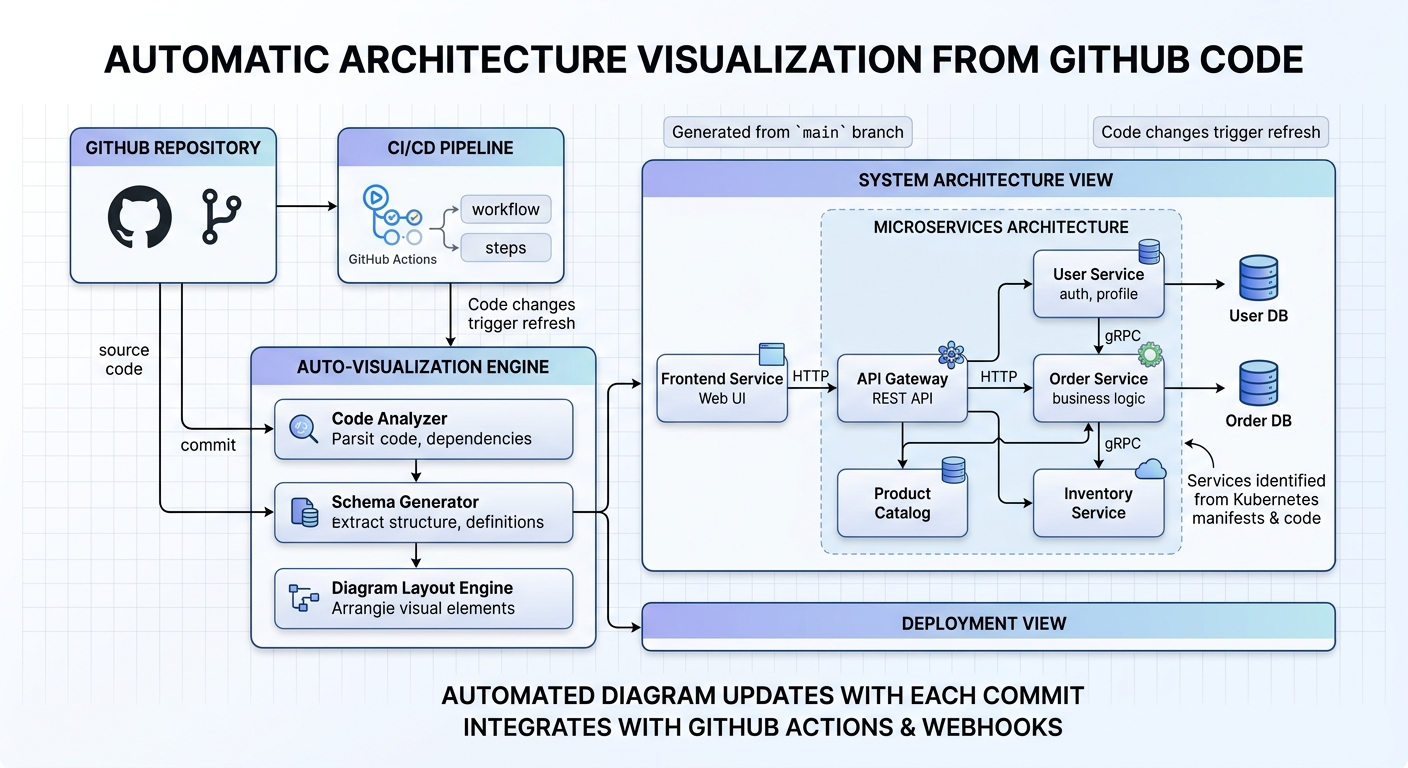
Archyl Review: The Architecture Diagram That Keeps Up With Your Code
Every engineer has drawn the same architecture diagram twice. The first time it takes hours. The second time is always worse, because the code has already changed since the first draft, and nobody told the diagram.
Archyl removes the drawing entirely. Connect it to GitHub or GitLab, and it scans your services, databases, and dependencies, then produces a C4 architecture diagram automatically. Every subsequent git push updates it without you doing anything.
C4 breaks architecture down into four levels of zoom: System Context, Containers, Components, and Code. Archyl handles all four. You can click any box in the diagram and see exactly what it connects to, what depends on it, and what happens at each level of detail. It’s the difference between a static diagram and a navigable map.
The practical value didn’t hit me until sprint ten of a project I’d been working on. Nobody had touched the architecture documentation in weeks. The diagram was current — because it had come directly from the code, not from someone’s memory of what the code was supposed to do. When someone new joined the team, they could navigate the architecture themselves instead of asking me to explain it.
The setup is straightforward if you’re already on GitHub or GitLab. The harder question is whether your team will actually trust a diagram that was auto-generated. There’s a bias toward hand-crafted documentation — if it looks like it was made by a machine, people sometimes assume it can’t be trusted. Worth being intentional about how you introduce it, and making sure the first version is accurate before you point people at it.
What I find more valuable than the initial diagram is the update behavior. When the diagram updates automatically after each push, it captures decisions that would normally never make it into documentation — the new service that got added but nobody documented, the dependency that quietly changed. It’s an audit trail of architecture decisions made in code, expressed visually.
The limitations are honest: it’s only as good as your codebase’s structural clarity. If your code is heavily tangled, the diagram will reflect that. It’s not a magic fixer for architectural debt. But for codebases that are reasonably well-structured, it’s one of the more practical documentation tools I’ve used.